A lot of musicians lose opportunities after the show, not on the stage.
A promoter asks for materials. A writer wants background for a feature. A festival booker needs something quick to review between calls. The artist sends a cluttered folder, an outdated bio, a few random links, and photos that don't match the current project. Silence follows. That usually isn't a talent problem. It's a packaging problem.
A strong press kit template for musicians fixes that. It turns scattered assets into one sharp, skimmable package that helps busy gatekeepers decide fast. The modern version has to do more than list credits. It has to show movement, relevance, and enough proof that the recipient doesn't need to hunt for answers.
Table of Contents
- Your Press Kit Is Your Most Important Audition
- The Anatomy of a Winning Musician Press Kit
- Crafting Each Element for Maximum Impact
- Choosing Your Format EPK vs PDF vs One-Sheet
- Assembling Your Kit With Templates and Examples
- Distributing Your Press Kit for Real Results
Your Press Kit Is Your Most Important Audition
When someone in the industry says, “send over your stuff,” they're rarely asking for everything. They want the right things, fast. A messy set of attachments forces them to sort, interpret, and guess. Most won't bother.
A musician's press kit is the clean answer to that problem. It acts like a digital handshake, a resume, and a booking tool at the same time. It tells a promoter whether the act fits a bill, tells a journalist whether there's a usable story, and tells a talent buyer whether the artist looks ready.
The reason this matters more now is simple. Gatekeepers scan first and investigate later, if at all. If the kit makes the next step easy, it keeps the artist in contention. If it creates friction, the artist drops out before the music gets a fair hearing.
Practical rule: A press kit should answer three questions in under a minute. Who is the artist, what do they sound like, and why does this act matter right now?
That last part is where many kits fail. They describe identity but don't show momentum. A polished page full of adjectives doesn't beat a concise package with current proof, active links, and one clear contact path.
This is why a press kit template for musicians shouldn't be treated like a static document that gets updated once a year. It needs to work like a live sales asset. The strongest kits help the recipient make a quick professional decision without emailing back for missing basics.
The Anatomy of a Winning Musician Press Kit
A useful framework for a musician EPK describes it as a digital resume and lists 13 core elements: biography, fact sheet, social links, photos, streaming/download links, tour dates, lyrics, liner notes, album artwork, press coverage, press-release links, music videos, and testimonials/reviews, according to Kit's guide to musician EPK structure.
That doesn't mean every artist should dump all 13 into one cluttered page. It means the full toolkit exists, and the artist should choose what supports the current goal.
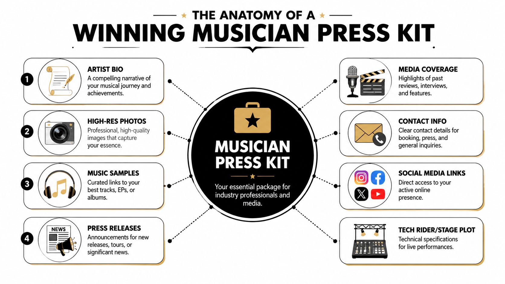
What belongs in the core package
Most working kits should open with the assets that make decision-making easiest:
- Artist identity: A short bio, artist name, genre positioning, and location.
- Best listening option: A direct stream to the strongest track or release.
- Visuals: Professional photos and current artwork.
- Proof: Selected press, testimonials, useful fact-sheet details, and signs of traction.
- Action path: Clear contact information for booking, press, or management.
The remaining elements come in when they help a real use case. Tour dates matter when booking live shows. Lyrics and liner notes matter more when the artist is pitching story-rich work to media. Press-release links help when there is a current announcement tied to the outreach.
What each asset is doing for the recipient
A good press kit isn't a scrapbook. Every component has a job.
| Element | Why it matters |
|---|---|
| Bio | Gives context fast and helps media frame the story |
| Fact sheet | Surfaces practical details without forcing the recipient to hunt |
| Social links | Lets the recipient verify activity and audience presence |
| Photos | Gives editors and promoters usable visuals immediately |
| Streaming links | Removes friction and gets the music heard quickly |
| Tour dates | Shows live activity and booking relevance |
| Lyrics and liner notes | Support deeper editorial or artistic storytelling |
| Album artwork | Keeps branding consistent across coverage and listings |
| Press coverage | Adds external validation |
| Press-release links | Supports current campaigns and announcements |
| Music videos | Shows presentation, performance, and audience appeal |
| Testimonials and reviews | Adds selective credibility when curated well |
A common mistake is treating every item as equally important. They aren't. A promoter usually cares more about live relevance, music access, visuals, and contact details than liner notes. A journalist may care more about the angle, the bio, and assets that can be used quickly.
The most effective kits don't feel comprehensive. They feel easy.
That difference matters. A complete but bloated file asks the recipient to edit on the artist's behalf. A disciplined kit signals professionalism before anyone hits play.
Crafting Each Element for Maximum Impact
A strong kit isn't built by collecting files. It's built by curating decisions. The same raw material can look amateur or industry-ready depending on sequence, length, and presentation.
Build a bio that works at different speeds
One of the most practical recommendations in musician EPK guidance is a layered bio strategy. WaterBear recommends an elevator pitch of a couple of lines, a paragraph of about 150 words, and an additional two-paragraph bio in its guide to creating an EPK for musicians. That structure works because journalists and bookers often decide within seconds whether to keep reading.
The order matters. Put the shortest version first. If the opening lines don't land, the longer bio won't save it.
A usable layered bio usually looks like this in practice:
- Elevator pitch: One sharp snapshot of sound, identity, and current angle.
- Short paragraph: Enough context for a listings editor, venue, or playlist contact.
- Longer bio: More story, influences, release context, and career framing.
Musicians often write bios that read like diary entries. That's a mistake. The bio isn't there to tell everything. It's there to make the artist easy to place. Anyone struggling with tone can learn from broader brand-writing approaches such as these About Us page strategies for small businesses, especially the balance between story and credibility.
Choose visuals and audio that earn attention
The first track has a heavier job than the rest. It has to represent the act quickly and make the recipient want to continue. If the strongest song is buried under filler, the kit is working against itself.
Use direct streaming links, not confusing download gates. If the artist has multiple versions of a release in circulation, choose one clean destination and stick with it. Rich media also needs restraint. A well-placed live clip and a clear music link beat a cluttered page full of embeds. Teams refining that presentation can borrow ideas from these examples of using multimedia in press releases with images, videos, and infographics.
Photos need to do one thing well. They should make the artist look current, coherent, and usable for media. A random mix of old headshots, live phone captures, and mismatched artwork creates doubt about whether the project is active.
Good press photos usually share a few traits:
- Current look: They match how the artist appears now, not a past era.
- Clean composition: Editors can crop them without destroying the image.
- Brand fit: The styling reflects the actual music and market.
- Usable variety: There is at least one obvious hero image and a few supporting options.
A press photo isn't just an image of the artist. It's a shortcut for how the recipient will present the artist to everyone else.
Use proof without turning the kit into a spreadsheet
Proof belongs in the kit, but it has to be selective. Too much data makes the artist look insecure. Too little makes every claim feel unearned.
What works best is a compact proof section near the top or middle of the page. This can include a short list of current wins, selected media quotes, notable support, or audience signals that help a decision-maker.
Keep the language plain. If a show sold well, say so clearly. If a recent release drew strong attention, present the most relevant signal rather than dumping platform screenshots. The point is to reduce doubt, not to overwhelm.
Choosing Your Format EPK vs PDF vs One-Sheet
Format changes how the same information feels. A sharp press kit in the wrong format can still miss the mark because the recipient can't use it easily in the moment.
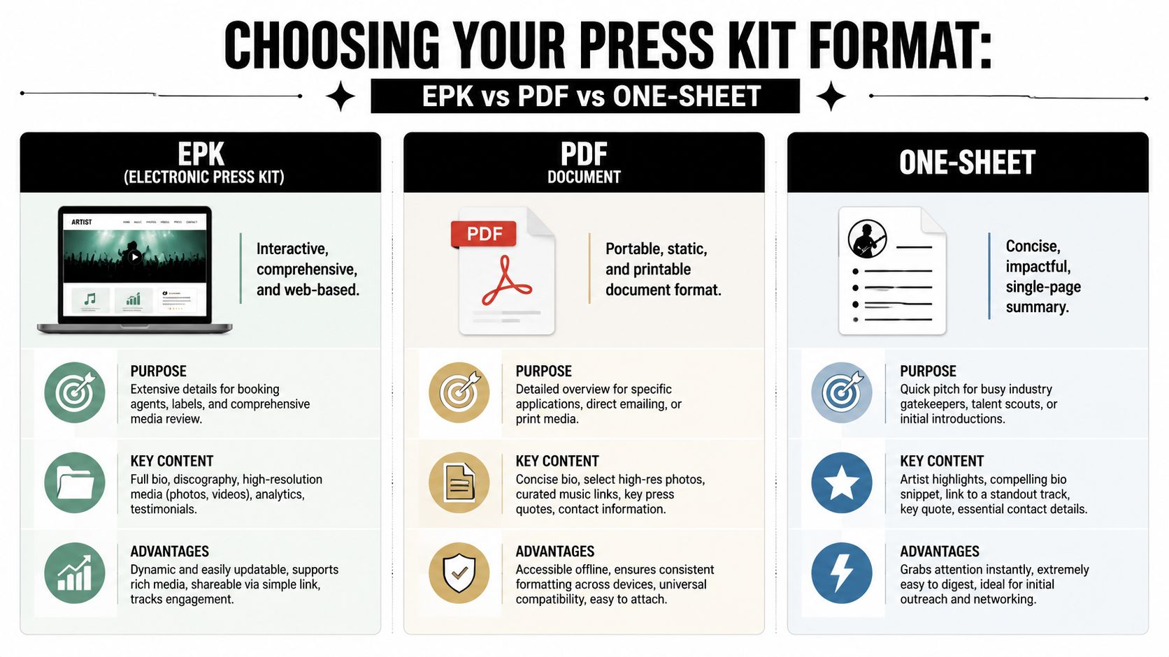
How the three formats differ in practice
A web-based EPK is the most flexible option. It can be updated quickly, shared with a simple link, and built around streaming, video, and fast scanning. It's usually the best home base because it stays current.
A PDF works when the recipient needs something portable, printable, or easy to forward internally. It gives the artist tighter control over layout, but it can feel static fast. If links break or milestones change, the file ages poorly.
A one-sheet is the fastest pitch tool of the three. It isn't the full story. It's the teaser that gets the second look.
For a broader communications perspective on format choices, this explainer on press kit vs media kit differences and best practices is a useful companion.
Which format to send in common situations
| Feature | EPK (Webpage) | PDF (Document) | One-Sheet (Single Page) |
|---|---|---|---|
| Best use | Ongoing industry outreach | Direct submissions and attachments | First contact and quick handoffs |
| Strength | Easy to update and browse | Stable layout and easy forwarding | Fast to read |
| Limitation | Needs clean hosting and maintenance | Gets outdated | Lacks depth |
| Media support | Strong for streaming and video | Moderate | Light |
| Best recipient fit | Bookers, labels, managers, media | Editors, applications, internal teams | Scouts, conference contacts, busy promoters |
The strongest setup isn't choosing one forever. It's using all three with intention.
- Use an EPK as the living master version.
- Use a PDF when an application form or editor expects an attachment.
- Use a one-sheet when the recipient needs the fastest possible overview.
Send the format that matches the recipient's workflow, not the format the artist happens to prefer.
That small adjustment changes response rates qualitatively because it respects how people review submissions.
Assembling Your Kit With Templates and Examples
Templates are useful only when they force good decisions. A weak template just gives bad habits cleaner spacing. A strong one puts the most persuasive material where a gatekeeper is most likely to see it.
Industry guidance has become much more data-aware. Bandzoogle notes that artists should include numbers that show momentum, such as significant radio play, an impressive number of streams, and other easy-to-read stats, while limiting press coverage to three to five of the strongest pieces in its EPK examples guide. That guidance is less about decoration and more about credibility.
A working template structure
A solid press kit template for musicians usually follows this order:
Header block
Artist name, genre cue, location, and one-line positioning.Immediate listen section
One featured track or release, placed high on the page.Short bio
Brief enough to scan on mobile without effort.Proof strip
A few easy-to-read stats, one or two meaningful milestones, and selected support.Visual gallery
Hero press photo first, then supporting images.Video and live proof
One recent live clip or high-quality performance asset.Selected press
Only the strongest coverage, not every mention the artist has ever received.Contact block
Booking, press, management, and website or primary link hub.
This structure works because it lets someone form an opinion in stages. Identity first. Music second. Proof third. Logistics last. That's the order most recipients need.
What strong and weak layouts usually look like
A strong example opens with clarity. The artist's current project is obvious. The best track is one click away. The page shows enough evidence to justify continued attention. Nothing feels buried.
A weak example often starts with a long, self-important bio. The music sits lower on the page. Press logos outnumber useful facts. Contact details are tucked into the footer, and the visuals don't match the current release cycle.
The better model is a dynamic one. When the artist lands meaningful support, updates a release, or adds stronger performance footage, the kit changes with it. That keeps the page from becoming a museum of old wins.
A simple quality check helps:
- Can someone hear the best song immediately
- Can someone describe the artist after a quick skim
- Can someone find proof without scrolling forever
- Can someone contact the right person without guessing
If any answer is no, the template needs revision, not more content.
Distributing Your Press Kit for Real Results
A polished kit on a hard drive doesn't book shows, generate coverage, or start conversations. Distribution is where the work either compounds or stalls.
Recent momentum is the missing ingredient in many kits. ReelCrafter's EPK guidance points out that artists should feature recent performance video, update the kit when milestones change, and remember that busy recipients may only listen to the first one or two tracks in its overview of what artists need in electronic press kits. That changes how outreach should be handled. The kit has to feel current at the exact moment it's sent.
How to send it without wasting the opportunity
Match the contact list to the artist's actual lane. A venue booker, a niche blog editor, a festival programmer, and a playlist curator won't all care about the same angle. Outreach works better when the email and the kit reflect the recipient's role.
Keep the message short. Lead with relevance, not autobiography. The press kit should carry the detail so the email can stay lean.
A practical outreach note often includes:
- Why this recipient fits: A brief line showing the pitch isn't random.
- What is current: A new release, upcoming date, or timely angle.
- One clear action: Review for booking, coverage, inclusion, or follow-up.
- The kit link: Clean, direct, and easy to open.
Artists planning broader campaign support can also compare options for music press release distribution services when they need added reach around a release or announcement.
How to keep the kit dynamic after it goes live
Static kits gradually go stale. Old dates, outdated visuals, and dead links signal neglect even when the music is strong.
A dynamic press kit gets refreshed whenever the artist has a meaningful change worth showing. That may be a stronger live clip, a more representative lead track, a new press quote, or a recent milestone that helps prove demand. The point isn't constant tinkering. It's making sure the current version reflects the current project.
Keep the kit lean, current, and easy to trust. Relevance beats volume every time.
The best outreach happens when the artist doesn't need to scramble for materials after an opportunity appears. The kit is already live, current, and built to answer the next professional question before it's asked.
Artists and teams that need sharper media materials can find practical templates, distribution guides, and PR workflows at Press Release Zen. It's a useful resource for turning announcements, press assets, and outreach into something media contacts can effectively use.