You've polished the headline, checked the quote, and rewritten the lead until it finally says something meaningful. Then the release lands in a journalist's inbox as a crowded attachment, a broken block of HTML, or a PDF that's difficult to read on a phone. The news may be solid, but the presentation creates friction before the story gets a fair hearing.
A practical format press release template has to do more than look formal on a page. It must help editors extract the news quickly, preserve credibility across email and wire distribution, and work as a readable web document after publication. The classic newsroom structure still matters, but modern distribution demands choices about links, responsive layouts, attachments, and content management systems.
Table of Contents
- Why Press Release Formatting Determines Whether Your Story Gets Read
- The Essential Structure of an AP Style Press Release Template
- Layout Specifications That Meet Newsroom Standards
- Choosing Between Word, PDF, and Online Page Formats
- When to Break the Standard Template for High-Impact Announcements
- Common Formatting Mistakes That Get Releases Ignored
- Your Press Release Formatting Checklist
Why Press Release Formatting Determines Whether Your Story Gets Read
A communications professional can spend hours refining a headline and lead, then lose the reader with a document that looks unfinished. A reporter scanning an inbox sees the sender, subject line, attachment type, opening lines, and visual density before deciding whether to continue. If those signals suggest extra work, the release may be deleted before its strongest sentence is ever seen.
Formatting functions as a professional credibility test. A clear dateline, restrained headline, readable paragraphs, and visible contact block tell an editor that the organization understands how news copy is handled. The modern template remains widely taught because its sequence maps directly to newsroom scanning and processing, as explained in AP Style press release guidance from PR Newswire.
The first scan is a usability test
A journalist doesn't read every release from top to bottom. The editor looks for the announcement, the relevance, the person who can verify it, and material that can support a story. Strong formatting makes those answers easy to locate without turning the document into a sales brochure.
A release with a concise headline and a direct lead creates a clean entry point. Short paragraphs prevent the body from becoming an impenetrable block. A quote provides usable language, while a boilerplate and contact block give the editor the context needed for follow-up.
Practical rule: Format the release so an editor can understand the announcement, identify its relevance, and find a human contact without hunting through the document.
Digital delivery raises the stakes
Traditional layout still signals newsroom readiness, but email and web distribution introduce additional failure points. A file can display correctly in Microsoft Word and break in an email client. A PDF can preserve its design while making copying, searching, or mobile reading inconvenient. An online version can improve accessibility and sharing, but only if the CMS presents the release as a real page rather than a decorative image.
Independent guidance notes that online versions and shareable links are becoming more common, while formatting guides increasingly include multimedia assets, hyperlinks, and social calls to action. The same guidance cites an independent benchmark placing press-release open rates at around 25% in 2025, which makes scannability and linkability practical distribution concerns, not cosmetic preferences. See the modern press release format guide from Prowly for this digital distribution perspective.
The Essential Structure of an AP Style Press Release Template
The standard template works because each component answers a different editorial need. It gives the reader a predictable path from announcement to verification, and it gives the editor a document that can be shortened without destroying its meaning.
Start with release status and the headline
Place FOR IMMEDIATE RELEASE near the top when the information can be published immediately. If the announcement is embargoed, replace that treatment with clear embargo instructions agreed with the recipient. The media contact can appear at the top or bottom, but it must be easy to find.
The headline should state the news with an active verb and without promotional padding. A subheadline can add essential context, but it shouldn't repeat the headline in different words. Avoid turning either line into an advertising slogan.
Use the dateline and lead correctly
The dateline begins the opening paragraph. Under AP-style conventions, it uses the city in all caps, followed by the state, county, or territory and the date. The lead should answer the central questions quickly, including who, what, when, where, and why. The first sentence should carry the announcement, not a history of the organization.
The body then supplies context, evidence, and quotes. Each paragraph should contribute information a journalist could use, such as what changes for customers, why the announcement matters, or where supporting material can be found. Quotes should add perspective rather than repeat the lead.
Finish with boilerplate, contact details, and an end marker
The boilerplate gives a concise description of the organization and its work. It should remain consistent with the company description used on the newsroom page and other official materials. The media contact block should include a named person, title, email address, and phone number.
The traditional release ends with ###, although some organizations use -30- or Ends. These markers remove ambiguity about whether more copy follows. The structural sequence and its editorial purpose are illustrated in this AP-style press release format sample.
A reliable template should preserve this order even when the release later becomes an HTML page. Digital presentation can change, but the underlying editorial logic shouldn't disappear.
Layout Specifications That Meet Newsroom Standards
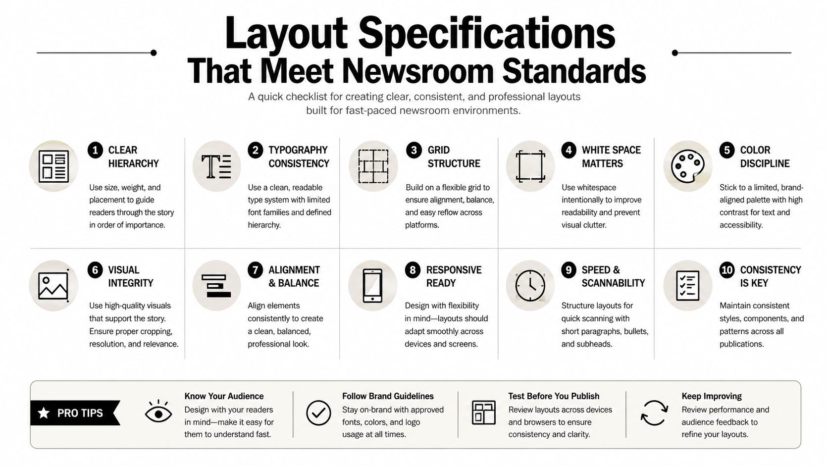
A press release should be easy to read in print, on a desktop screen, and after conversion into another publishing system. The safest approach is restrained formatting, familiar typography, and enough white space to separate the news from supporting details.
The default specification
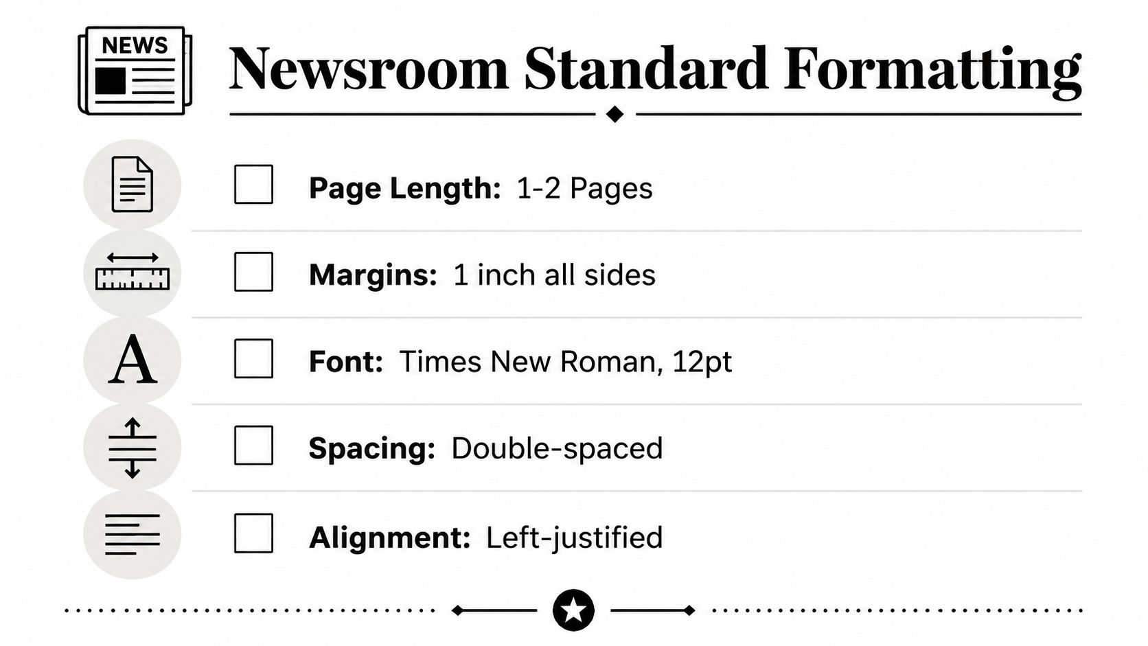
A university writing guide recommends a one-page default, single spacing, 1-inch margins, 12-point body text, 14-point headline text, left-aligned body copy, and a target of 300 to 600 words. The guide also recommends a centered headline and plain-text email delivery or a PDF or DOCX attachment when those options preserve readability across newsroom workflows. These specifications appear in the Ohio State University press release structure guide.
The practical specification looks like this:
- Page length: Keep the release to one page by default. Use a second page only when the news requires it.
- Margins: Set all margins to 1 inch so the copy has breathing room and remains easy to print.
- Typography: Use a conventional, readable typeface and keep body text at 12 points. Set the headline at 14 points rather than using oversized display text.
- Spacing: Follow the selected house or newsroom standard consistently. Avoid compressed paragraphs that make the page visually dense.
- Alignment: Keep body copy left-aligned. Center the headline only when the chosen template calls for it.
- Continuation: If a second page is unavoidable, mark the first page as continued and make the transition obvious.
Protect the file after it leaves the office
Use a descriptive filename that identifies the organization and announcement. Avoid filenames such as “final-final-new.docx,” which create confusion when several attachments circulate. Before sending, open the document on another device, paste the body into a plain-text editor, and inspect the web version in the target CMS.
A release longer than one page isn't automatically unusable, but it needs a clear more marker at the bottom of the first page and continuation labeling on the next. Higher-education and government-style guidance also recognizes end markers such as ###, -30-, and Ends, while cautioning against releases that exceed one page without a clear reason. See the higher-education press release guidance from University of the Arts London for the structural rationale.
Choosing Between Word, PDF, and Online Page Formats
The right delivery format depends on the recipient's workflow. A single journalist may want editable copy, a wire service may require a structured submission, and a company newsroom needs a searchable page that works for readers and search engines.
| Format | Best For | Editability | Mobile Friendly | SEO Value |
|---|---|---|---|---|
| Word document | Direct pitches and collaborative review | High | Variable | Limited unless republished |
| Preserving a formal page layout | Low | Variable | Limited unless supported by an HTML page | |
| Online page | Company newsroom, sharing, and search discovery | Controlled through CMS | High when responsive | Strongest of the three when properly published |
Word documents preserve flexibility
A DOCX file works well when a journalist may need to copy text, request revisions, or adapt the release for a publication. It's also useful during internal approvals because reviewers can comment and edit. The trade-off is presentation control. Fonts, spacing, tables, and line breaks can shift between applications, so the sender should test the file outside the original authoring environment.
PDFs preserve appearance, not convenience
A PDF is useful when the release must look exactly as approved, particularly for formal announcements or records. It protects the intended page design, but it can slow down copying, searching, and mobile reading. A PDF shouldn't be the only version when the recipient needs to extract text quickly.
A practical discussion of these trade-offs appears in Press Release Zen's PDF versus Word best practices.
Online pages support modern discovery
An HTML newsroom page can provide responsive text, descriptive links, accessible headings, multimedia, and a stable URL for social sharing. It also gives the organization a canonical public version that journalists can reference. The page should retain the dateline, lead, body, boilerplate, and contact information, while adding useful web elements such as an image caption, related media links, and a clear page title.
The strongest approach is often hybrid. Use an online page as the public source, provide editable copy when a journalist needs it, and attach a PDF only when preserving the approved layout has a clear purpose.
When to Break the Standard Template for High-Impact Announcements
The classic structure is dependable, but it isn't universal. A routine event notice or straightforward partnership usually benefits from the inverted pyramid. A product launch, executive transition, funding announcement, or strategic shift may need more explanation before the reader understands why the news matters.
Match the structure to the announcement
A product release can lead with the customer problem instead of the company's internal milestone. The lead still needs to identify the organization and announcement, but the next section can explain the user need, the change, availability, and evidence. A short FAQ block can answer practical questions that a standard boilerplate would leave unresolved.
An executive announcement requires a different emphasis. The release should identify the outgoing and incoming leaders, explain the transition clearly, provide relevant background, and make the next step visible. A generic quote about excitement weakens the announcement, while a precise statement about responsibilities or direction gives reporters something useful.
Funding and acquisition news often need a transparent explanation of what changes for customers, employees, partners, or communities. The classic template can remain underneath a more reader-centered opening, rather than forcing every detail into a rigid lead.
Use performance context carefully
Independent benchmark material reports different open-rate ranges by announcement type: 40% to 55% for funding or acquisition emails, 35% to 48% for product launches, 28% to 38% for leadership news, and 32% to 45% for annual results. These figures come from Working Backwards' PR/FAQ resource, and they should be treated as directional benchmark data, not a promise for an individual campaign.
The useful lesson is structural, not numerical. A product launch may need a customer-centered explanation and visuals. Leadership news needs credibility and continuity. Financial or strategic announcements need precision, context, and answers to predictable stakeholder questions.
A standard template should be the starting architecture, not a rule that prevents the reader from understanding the announcement.
PR/FAQ-style writing can help when anticipated questions are central to the story. It shouldn't replace factual discipline. The dateline, contact block, organizational identity, and clear announcement still need to remain visible.
Common Formatting Mistakes That Get Releases Ignored
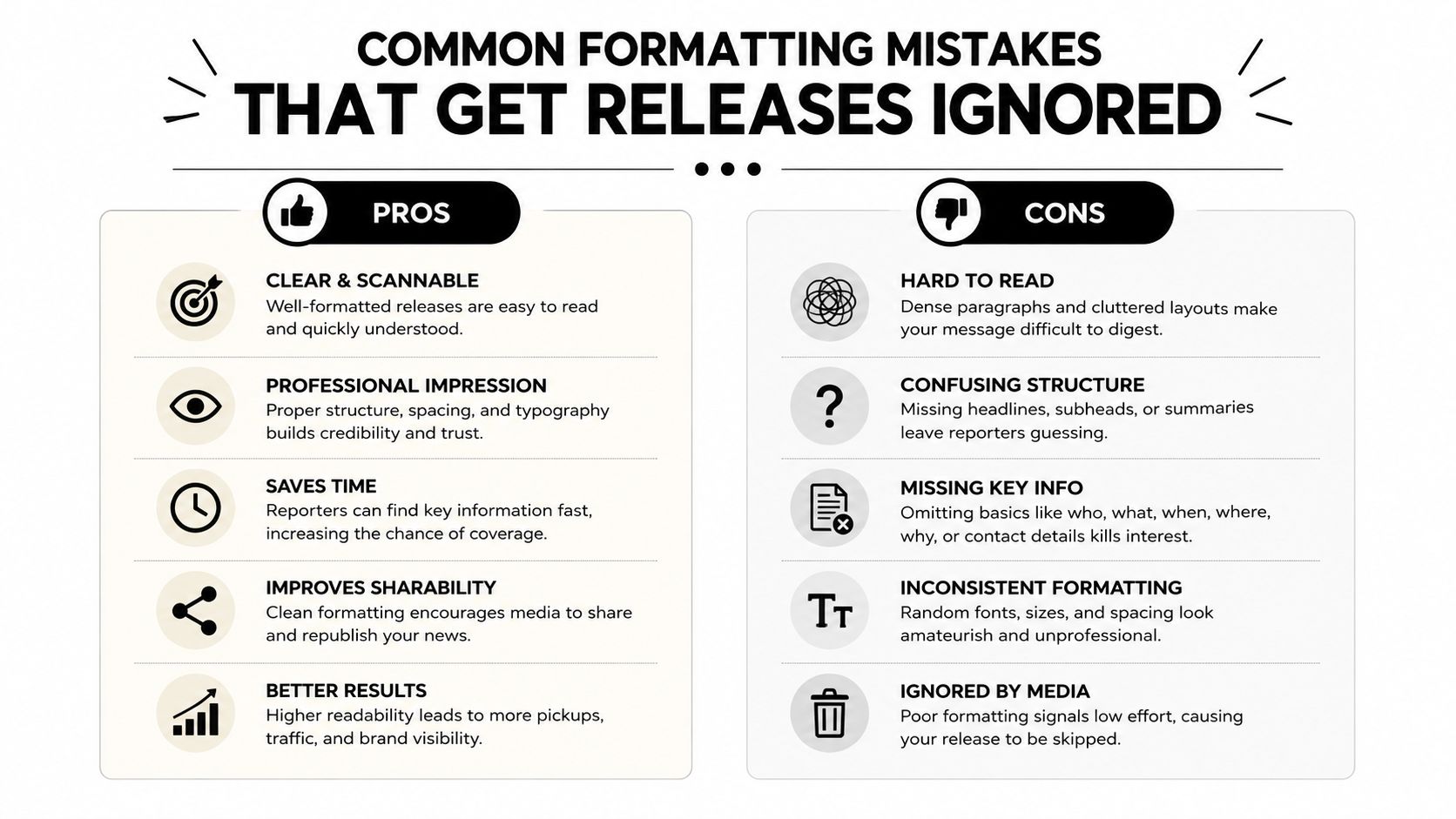
Editors don't need a dramatic formatting failure to reject a release. Small signs of carelessness can be enough to make the document feel harder to verify or publish. The fix usually involves simplifying the page rather than adding design.
The visible problems
- Overloaded headlines: A headline packed with claims, slogans, and multiple announcements obscures the actual news. Replace it with one active statement.
- Weak datelines: A missing city, inconsistent capitalization, or unclear date forces the editor to interpret basic facts. Apply the same dateline convention throughout the release.
- Dense paragraphs: Long blocks hide the lead and make mobile reading unpleasant. Break paragraphs when the subject or purpose changes.
- Missing contacts: An anonymous or incomplete contact block creates verification friction. Name a reachable media contact and include the necessary details.
- Unclear endings: Without an end marker, a recipient may wonder whether the copy is incomplete. Use ###, -30-, Ends, or the organization's accepted equivalent.
A release also loses credibility when it uses decorative fonts, excessive bolding, all-caps body copy, or inconsistent spacing. Formatting should guide attention toward the headline, lead, quote, and contact details, not compete with them.
Email and attachment failures
Copying a designed document directly into an email can produce broken line breaks, missing symbols, and unreadable spacing. Sending only an attachment can also create unnecessary friction, especially when the subject line and first visible lines fail to explain the announcement. The safest practice is to provide a concise email introduction, include the essential release text in a readable form when appropriate, and link to supporting assets rather than attaching large files.
The press release mistakes guide from Press Release Zen provides a useful review framework for structural and presentation errors.
The content can be accurate and still look promotional
Superlatives, vague claims, and repeated brand language make a release resemble an advertisement. Quotes should carry opinion, while the surrounding copy should state verifiable facts in plain language. If the announcement can't be understood from the headline and lead, more styling won't solve the problem.
Your Press Release Formatting Checklist
A reusable checklist turns formatting from a last-minute visual review into a controlled publishing process. It should work for a DOCX pitch, a PDF attachment, and the online newsroom version, with channel-specific checks added before distribution.
Structural review
- News first: Confirm that the headline identifies the announcement rather than the organization's general ambition.
- Dateline present: Check the city, location convention, and date for consistency.
- Lead complete: Verify that the opening answers the central questions without forcing the reader into the second page.
- Body useful: Remove background that doesn't explain impact, context, or next steps.
- Quote purposeful: Make sure each quote adds a perspective a reporter couldn't obtain from the factual paragraphs alone.
- Boilerplate current: Match the organization description to the approved newsroom language.
- Contact block complete: Include a named person, role, email, and phone number.
- End marker visible: Add the accepted closing marker after the final copy.
Layout and delivery review
- Page settings checked: Apply the selected margin, font, spacing, alignment, and page-length standards consistently.
- Mobile test completed: Read the email and web page on a phone. Look for tiny text, awkward line breaks, missing links, and buried contacts.
- File choice justified: Use Word for editable copy, PDF for fixed presentation, and an online page for public access and search discovery.
- Links tested: Open every newsroom, asset, registration, or product link in an incognito browser and confirm that it reaches the intended destination.
- Assets accessible: Provide clearly labeled image or video links, with captions and usage information when relevant.
- CMS fields completed: Add a descriptive page title, readable URL, accessible headings, and an appropriate social preview.
- Approval frozen: After final approval, reopen the exact file or page that will be distributed. Don't assume the approved draft matches the published version.
The team should save a master template with styles for the headline, dateline, body, quote, boilerplate, contact block, and end marker. Separate versions can then support email, DOCX, PDF, and CMS publishing without rebuilding the document each time. Tools such as Microsoft Word's style inspector, Google Docs' page setup, and a CMS preview can catch basic defects, while a human review remains necessary for news clarity and tone.
A release is ready when an editor can scan it quickly, copy what matters, verify the source, and open the supporting material without fighting the format. That standard protects the credibility of both the announcement and the organization behind it.
Press Release Zen provides practical guides, AP-style samples, and format comparisons that help teams prepare newsroom-ready announcements for email, web, and distribution workflows. Visit Press Release Zen to choose a reusable template and apply the formatting checklist before the next release goes out.